pivoting the site design in a new direction
this is a bad idea. i know.
at some point i thought to myself "man im tired of the hypercard theme." so i started work on redesigning the website to be more "90s cgi themed", which sort of pushes the boundaries on what i've done previously when it comes to site design and css
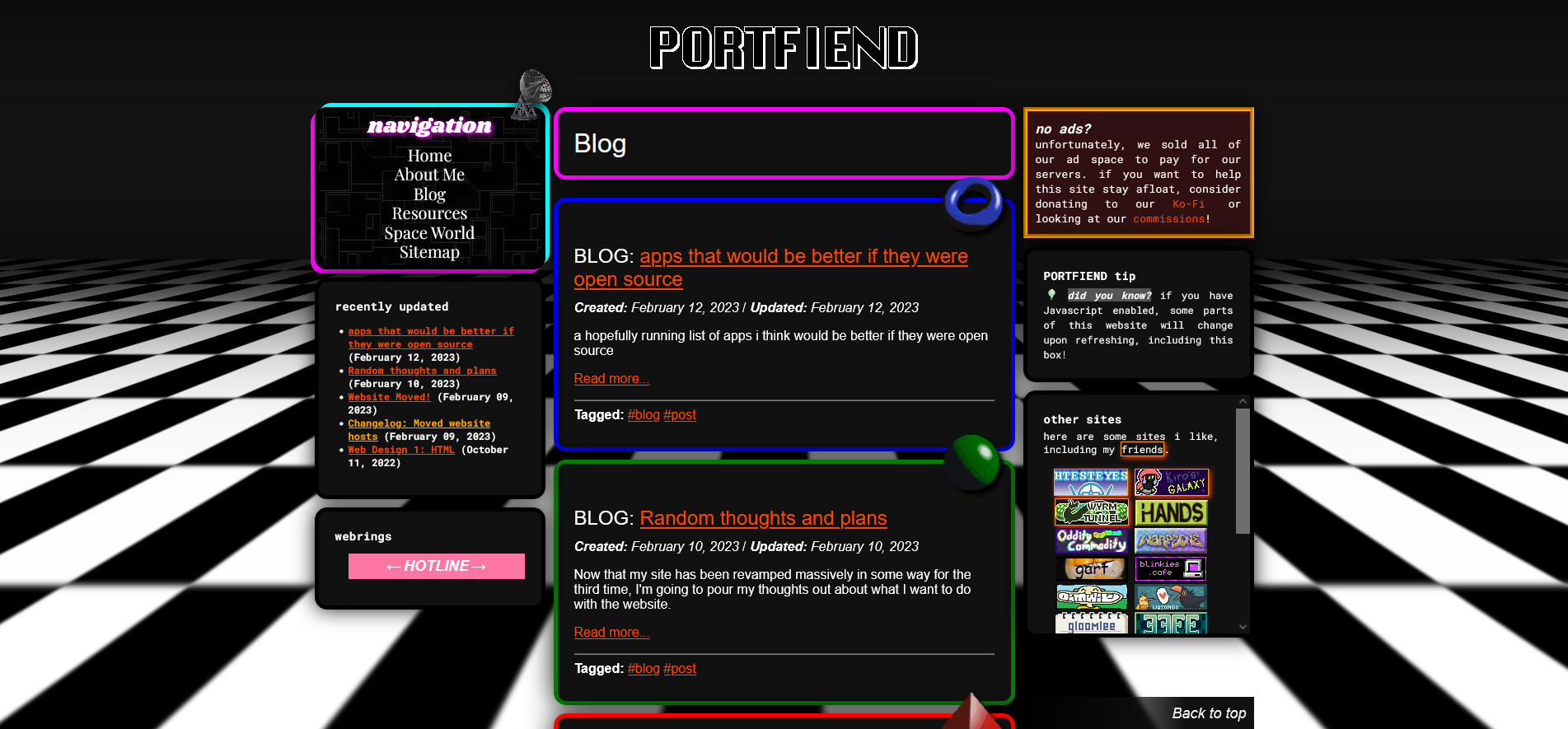
unfortunately, i made the mistake of taking too long to do this, which allowed the thoughts to stew and ferment in the brine of my brain. ultimately i realized that a) i don't have the energy to finish this and b) it's way too visually cluttered and distracting. it looked a bit like this, last time i touched it:
i don't want to hold up this site's development on this entire theme rewrite. however, i still feel like i can't show this site to people without a bit of shame. the hypercard theme was cobbled together pretty roughly, and i think i have a better understanding of flex and grid to be able to execute something nicer, not to mention usable on mobile.
so no matter what, i feel like i have to rewrite the theme before i work on this site more. i think it'll be best for me to choose a simpler theme. as much as i dislike minimalism, it might be a necessary evil - as bland as it tends to be, at least it's usable
thoughts on future design
first i would like to get over my baggage (this will be funny in a sec) with minimalism. there's a reason why i want a personal website instead of social media, not to mention a personal website instead of a carrd. being made the bitch of conventional, polished, corporate-minded design trends is soul-sucking in a way that pisses my little baby brain off.
i use eleventy to generate this website. have you ever looked at eleventy starter themes? so-called "best". it makes me sick. imagine using any of these for a truly "personal" website. i feel.... exhausted.
maximalism appeals to me because of its defiance, i think. minimalism is the "safe" option; maximalism requires a bit of taking risk. some of my favorite website layouts are hyper-dense two-sidebar "holy grail" layouts where every inch of screen space is another place to put something the webmaster loves. the density is cozy, not cramped; the authenticity feels like a breath of fresh air
i typed "fresh of breath air" like three times. fuck
one of my favorite sites ever is odditycommodity. but there is a small downside to this style of website - load times
i'm on a really shitty connection (about 600kbs to 2mbps) for the forseeable future. odditycommodity has taken upwards of ten minutes to load, and it still hasn't loaded. maximalism isn't the best option for my website, because what good is it if i can't even load my own website? plus, i don't collect nearly enough images to be able to use as assets to decorate the page with. gifcities takes way too long to load on this connection to feasibly use as a resource.
i think a big problem with minimalism for me is that a lot of web design minimalism is without any particular theme. minimal colors, a minimalist sans serif font, minimalist icons, but the final minimalist project never plays into a real relevant "theme" for the website. it's a minimalism you could copy paste and change some text and it would fit just as well. and there certainly doesn't feel like an emotional connection from the designer to the minimalist design
my hypercard theme is pretty minimalist, come to think of it. but there are very specific intentions when i made my hypercard theme.
one was to stand out; many personal websites play on 1990s and 2000s nostalgia, but few wanted to branch into the aesthetics of 1980s computer software.
second was that though i've never used hypercard, it was meaningful to me in a symbolic sense. it's sort of like flash, where people with no programming knowledge had this simple tool they could pick up and make little applets, which people made for themselves or showed to their friends. it spoke to me as a fresh webmaster, the idea of creating things for yourself. it sits in stark contrast in my mind against carrd - imposing strict limits on its users behind paywalls.
as i showed the hypercard theme to more and more people, a handful told me how intriguing it was to them, or how it made them feel. a few were delightfully surprised that i'd go for the 80s aesthetic slant. i do love positive attention.
despite all that, i think the hypercard thing has run its course, still. it's rough, it feels a bit like a gimmick, and like i mentioned, i've never used the program anyway. as Being A Webmaster settled into something completely normal and natural to me, the magic of the hypercard theme wore off, hence the rewrite.
i guess i don't have to make a minimalist or maximalist theme, i could go for a secret third thing if i like. but there's a reason why minimalism feels personally significant to me at the moment.
in transit
a small life update for readers. i no longer live in Alaska. i moved in with extended family in Florida around mid-April, hence why my connection is bad - this house does not have a router, meaning my connection is via hotspot, and the hotspot connection is Bad because this house is in the middle of of the woods.
i haven't really been able to freely leave the house for most of my teen years and my entire adult life. probably completely unironically before i landed in Florida, i've only Gone Somewhere (shopping etc) about 3-5 times a year.
it's almost a little embarrassing to admit, but public places fill me with a sort of whimsy, of unfamiliarity, of exploration. i think most people around me feel dulled by the world because going shopping is just a habit, a necessary evil, but not for me.
i kinda wish more people experienced the same feelings i do when i go shopping. every time i get to leave this house i feel like i'm reminded all over again how much i love the world around me.
something i take special notice of (when i get to leave the house) is visual design in public places, stuff like signage, pictograms, and color palettes. i don't have a formal visual design education, but i hold a deep appreciation for these "common" visual elements that other people take for granted. i never mention it to my family because they'd think i'm weird, but this site represents a lot of my clawing, desperate desire for authenticity.
airports have a special significance in my heart. i had to go through a few airports on my way here - anchorage, seattle, tampa. all have very different moods. i decided i don't like the seattle airport very much because we couldn't find any restaurants even though we walked for about twenty minutes.
transportation is deeply connected with wonder in my heart and brain, i think. i don't get to go places nearly enough. every time i take an airport out of alaska, it marks a period in my life where i get to go outside more - alaska is a bit of a prison. the airplane itself kind of feels bad, but airports are deeply wondrous places for me.
in a way, i'm still in transit. i don't know how long i'm gonna be in florida; i just know i'll probably be out by the end of the year. the pressure to get a job weighs on me heavier each day. soon i'll be faced with the pressure of moving out. the future is terrifying. right now, i am in transit.
i wonder if this time of my life is the last time i'll be able to feel the wonder and whimsy. in my near future, i'll be going shopping often enough that it falls into a habit. maybe the magic will disappear.
i don't think i'll ever reach a point in my life where the airport doesn't feel whimsical, though. i don't see myself flying that frequently. even if i flew once a month, somehow, i think it'll still feel new.
i think i could cobble together a theme inspired by the airports i've been to in my life, and similar sorts of things. transportation, delivery, the journey, exploration, and the "universal" language of airport pictograms that guide you where to go. i think it could lend itself well to minimalist web design in a way that feels significant to me. drop the baggage here.
some inspirations
- NYIA map design
- SEGD article on airport graphics
- Mini Metro
- Mini Motorways
- the visual design of Jazzpunk
- actual airport photos
- airport maps, diagrams, gate screens, signs, and similar
- the "free wifi" website that alaska airlines has
closing thoughts
man i type a lot
more like PILOTING my site design in a new direction! loL!
i have a new guestbook if you would like to give your thoughts